Your Cart is Empty
- Decor
- Kitchen
- Tabletop & Bar
- Lifestyle
- Inspiration

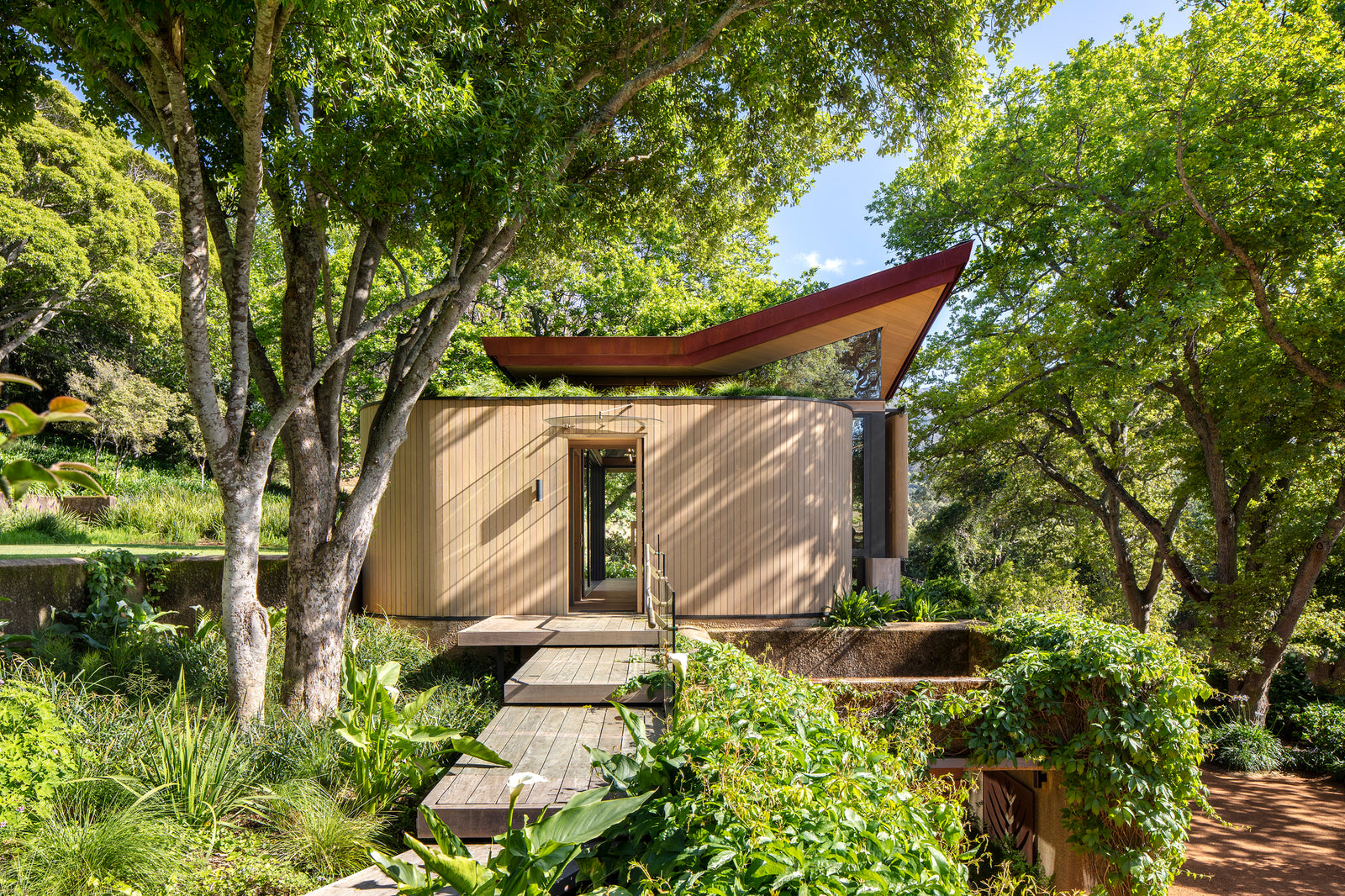
The project requirement requested that a gymnasium pavilion be added to the existing environment of a large family estate in Constantia. The architect firm Malan Vorster Architecture Interior Design was involved in the estate's master planning and various buildings.

The chosen location inside the estate offered interesting possibilities: mature trees gave protection, and siting precariously on the brink of an existing retaining wall produced a feeling of dynamic equilibrium. The location, which is between the main top lawn of the garden and the parking werf below it, would allow the building to engage with a variety of distinct view aspects while also connecting to the many terraced levels surrounding it. Because of its location, the gymnasium may potentially be linked to the guest apartment below by an internal stairway. The guest suite has been modernized with a new open-plan concept, finishes, and furniture.


Steel and timber construction methods were used to reduce the impact of concrete and other wet works since the majority of the components could be built off-site, lowering the environmental impact of the building process. For the same client, the architects were involved in the design and building of a tree house-like structure on higher terrain not far from the modern gymnasium pavilion. The tree home provided as inspiration for material selection, building process, and details.


Similarly, the gymnasium pavilion is an exercise in stepping gently on the landscape, with the goal of making the relationship with nature a primary design feature - notably given the owner's interest for nature and gardening. It was deemed critical that the structure be designed to be recessive to the landscape.


This objective, however, generated a paradox, because the pavilion typology is based on the physical rather than the immaterial. The older tree house project taught us that the materiality of a building can reduce the impact of an architectural object in the landscape: the natural textures and colours of wood and rusted steel, for example, can mitigate the starkness of glass; dematerializing building mass can be accomplished through the use of slatted screens and pergolas; and, most importantly, the result of time's passing should be embraced, so that natural weathering and oxidation can occur.


The building's tectonic stance, that is, making the architectural concept and logic clearly apparent to the observer or occupier, is viewed as a conversation between the reaction to the landscape, the technical construction components thereof, and the details of every material part of the building.


The gymnasium is placed beneath a pavilion-style and floating canopy. The roof is conceived as a folding and floating copper canopy, with two opposing corners raised upwards to provide views into the neighboring oak trees. The roof appears to float over frameless windows, which is achieved by sculpting the steel roof supports to blade-thin slivers.

The wall planes have been reduced to three different components. The first thing one notices is the curving and timber-clad façade, which holds the entry door and the stairway to the guest apartment in the existing building below. The curving wall features allude to the geometry of the next tree home.
Second, the façade facing the lower gardens and parking "werf" is a mix of semi-transparent and solid planes: the glazing and aero-foil shaped timber privacy screen elements rest on a sandstone slab wall set back from the existing building edge, allowing plants to creep over the rough and unpainted plaster wall of the guest unit below. The new gym's sandstone wall covering is a beautifully honed plane that contrasts with the original building's crudely hewn sandstone buttresses. The aero-foil timber screens may be changed by the resident to provide seclusion when exercising or to open up views to the north-eastern gardens and antique cork oak trees.

Third, the remaining two facades are glass, with stacking sliding doors that extend entirely to the building's corner, viewing a new surrounding fish pond. The doors lead to a meditation terrace on the northwestern side, which is shaded by an overhanging timber pergola. This balcony offers expansive views of nearby vineyards and distant mountains.


The multiple facades are physically connected by a steel H-section column and beam structure, two of which extend to form the pergola. Steel H-sections have been filled with western red cedar pieces, all of which have been sculpted to have softer organic features and edges.


The interior material palette of the gym is a continuation of the material palette of the structure, with cedar ceilings, rough sawn timber flooring, and traces of hand turned brass pieces. The same materials are used in the remodeling of the existing guest apartment below, which can be reached from the gym through a cedar-clad stairs lighted from above by a spherical skylight gazing up into the tree branches.


The guest unit comprises of a living/dining area with a kitchenette that is connected to a bedroom suite with privacy pocket-doors on both sides of a floating central tv-unit and headboard wall. The architects created the kitchen and all other cabinetry from scratch.


Photographs by Adam Letch.


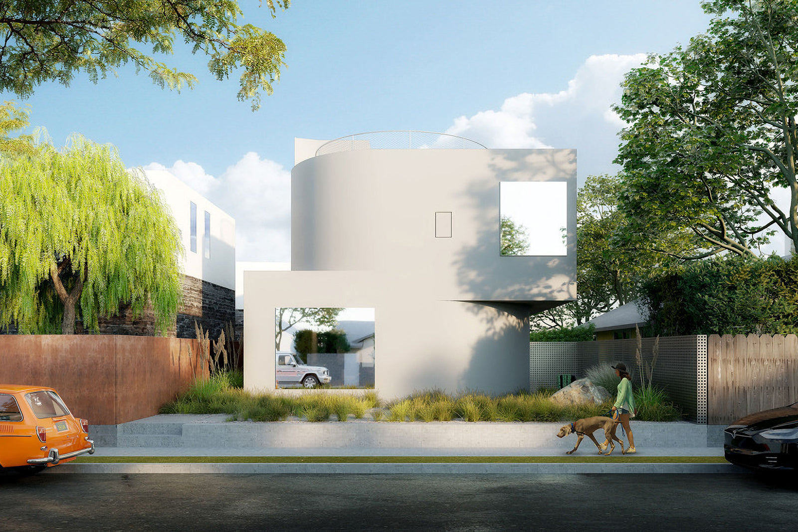
The Radius House is the young firm's first residential project, which was finished in the early weeks of 2022.